
Dark Blue
- #003D5B
- R:0 G:61 B:91
- C:100 M:32 Y:0 K:68

Kensington Blue
- #0078AE
- R:0 G:120 B:176
- C:87 M:47 Y:11 K:1

Kensington Sky Blue
- #00D1FF
- R:0 G:209 B:255
- Use for digital assets only.
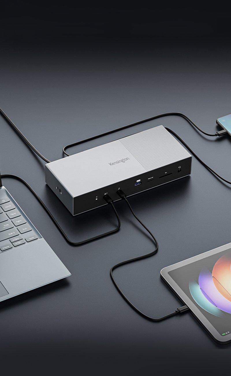
Seamless multi-monitor setups, 80Gbps transfers, 120Gbps bandwidth boost, and 140W power delivery.
Learn more
Free Shipping on Orders $49+

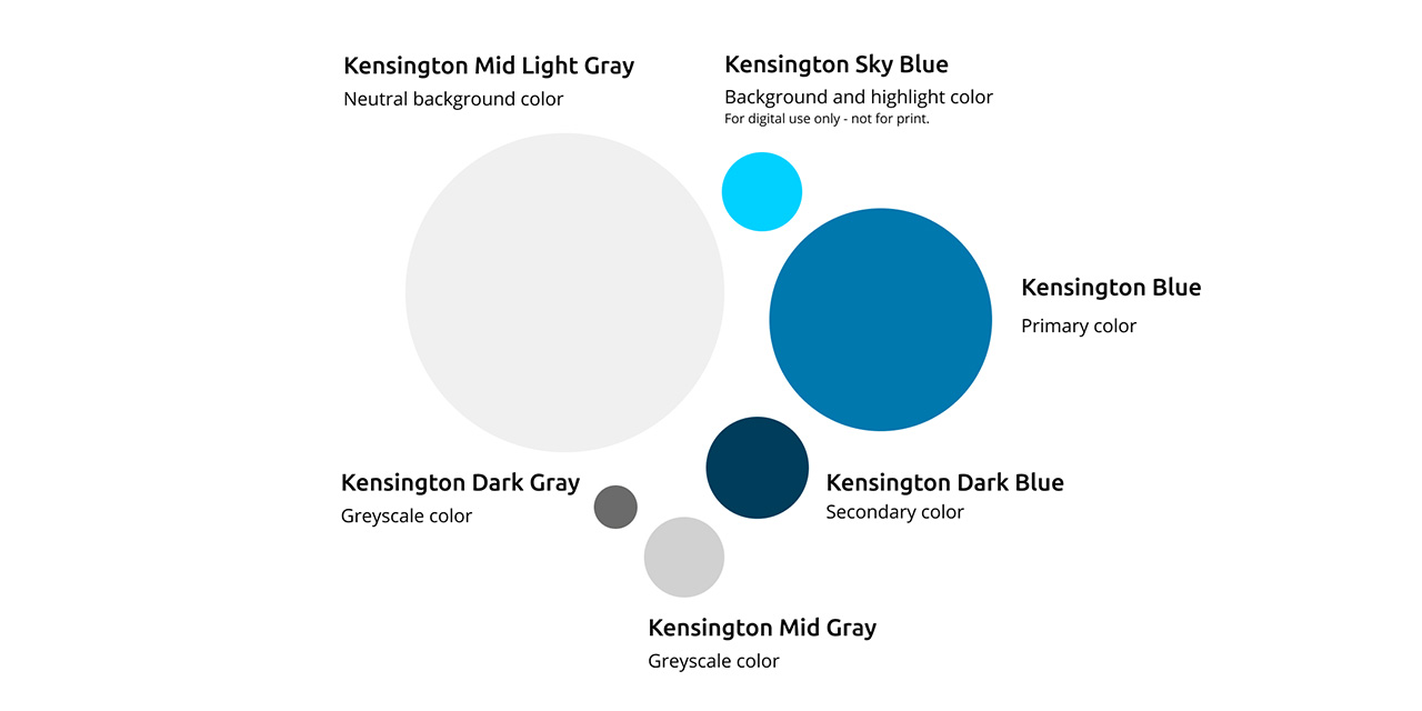
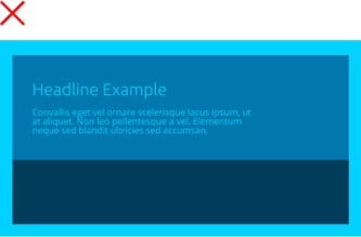
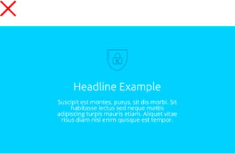
The blue color scheme combined with our gray tones gives the brand a strong and professional appearance. To highlight the strong base, the color “Sky Blue” has been added. It will only be used in digital applications as it does not have an appropriate print equivalent.
Dark Blue
Kensington Blue
Kensington Sky Blue

Kensington Nearly Black

Kensington Dark Gray

Kensington Mid Gray

Kensington Light Gray

Kensington Light Gray
Colors must be used in the correct proportion to ensure that the balance between dark and light best supports Kensington’s professional, modern look and feel.
This table will help you determine the best color pairings. For optimal readability, try to create a strong contrast between each color. Different color shades require different rules. Use this tool if you need further information on a specific color pairing: webaim.org/resources/contrastchecker
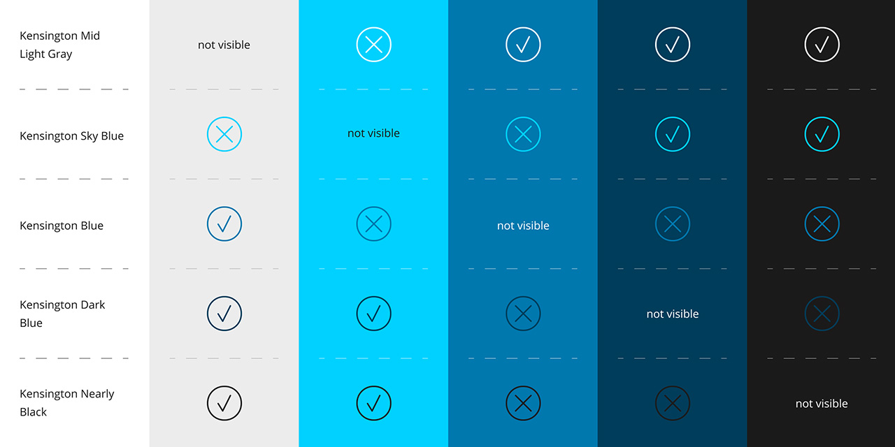
Try not to use too many blue colors in one composition.
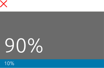
Try to use the correct color proportion.

Don’t create new colors by using color effects on photography.

Don’t use color solids with transparency on photography.

Don’t use colored backgrounds for photography. Only use defined purposes for the colors.
Please make sure the color contrast is high enough.
These guidelines are for anyone building Kensington marketing assets, so that we can ensure brand consistency and maintain a strong brand across all properties. Please email any issues to Kensington Global Marketing: