Suggestions
- No Suggestions
Recommended Products
- No Recommended Searches
Site Pages
- No Related Site Pages
This guideline will provide an overview of the font usage for web and print. It will explain when to use which font and how to combine fonts.
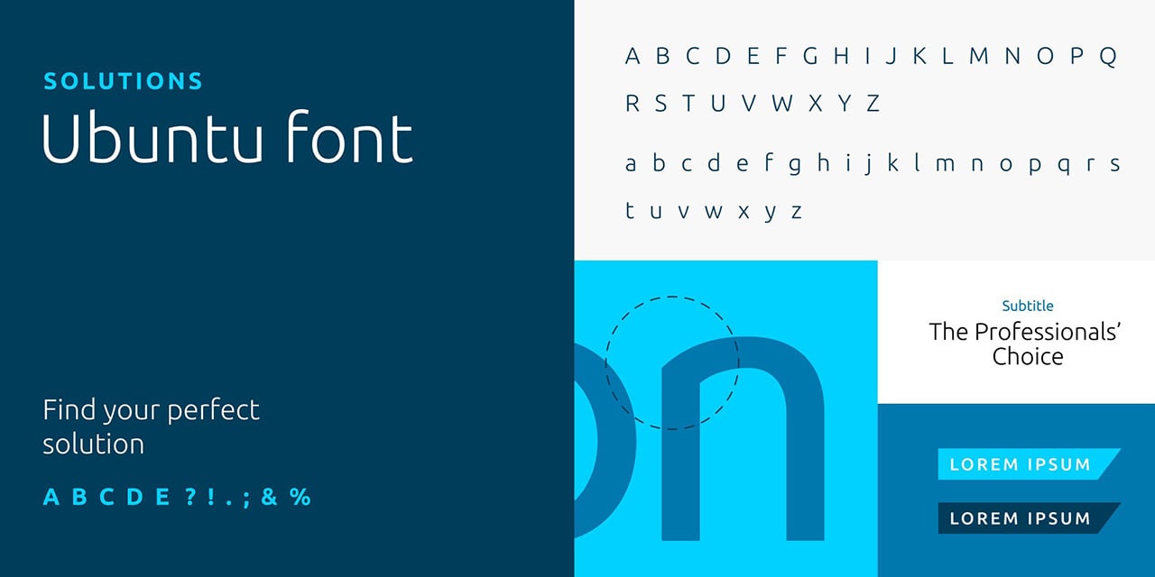
We use Ubuntu for headlines because of its unique characteristics that embody the brand. For body text, use Open Sans. These two fonts are web optimized Google fonts and free licensed font families.

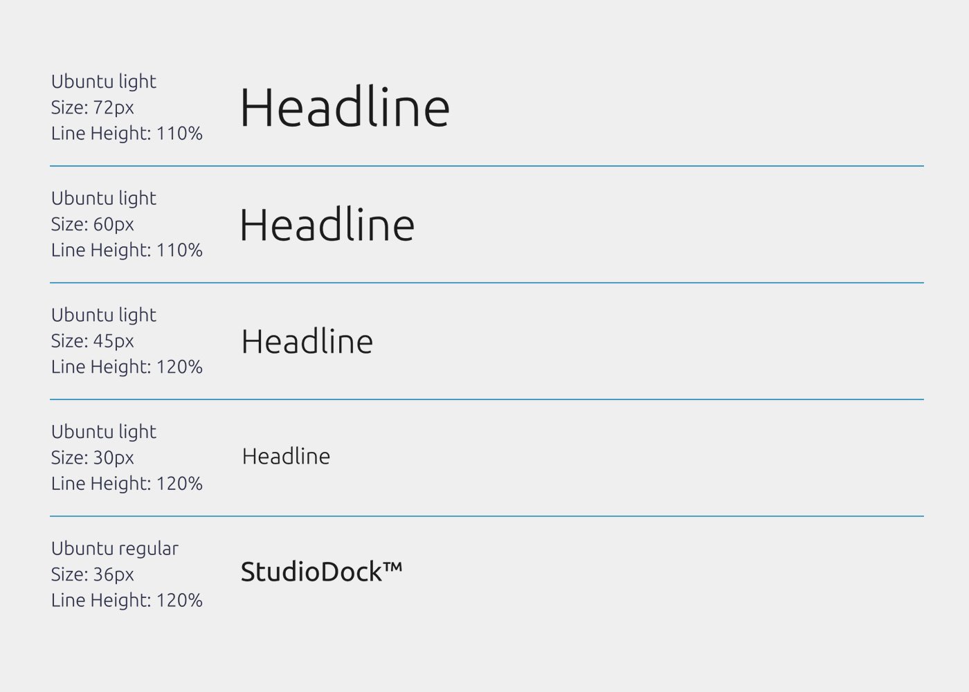
The recommended line spacing is 110% for all headlines. This can vary depending on the font size. The font size and weight depend on the usage as you can see on the right.
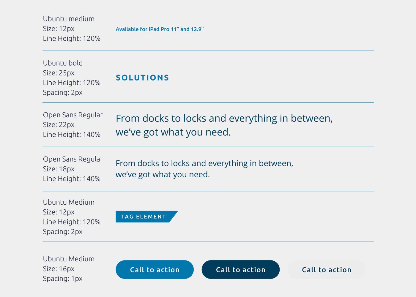
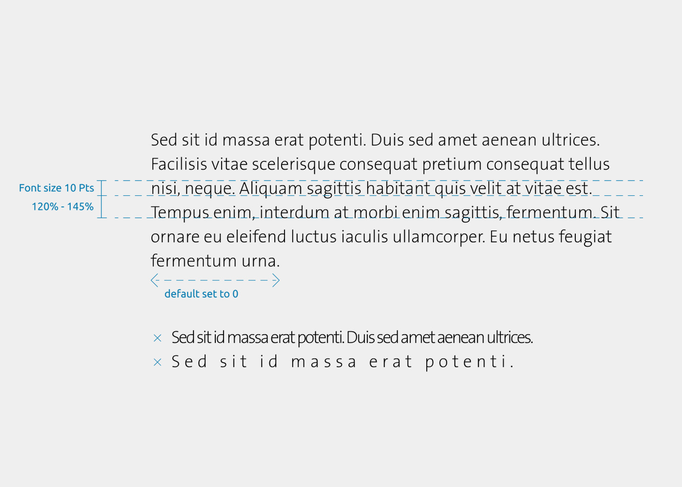
The recommended line spacing is 110%. This can vary depending on the font size and usages. The font size, weight and letter spacing depends on the usage as you can see on the right. Colors can be used as an additional highlighter if necessary.
We use Ubuntu for headlines because of its unique characteristics that embody the brand. For body text, we use TheSansKens. Compared to web usage, Ubuntu needs to be adjusted in line heights and spacing for print usage. TheSansKens font is an optimized print font that is specially made for the Kensington brand and perfect for printed body copies. Always combine the body copy font (TheSansKens) with the headline font (Ubuntu)

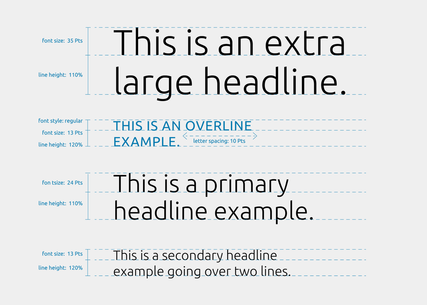
There are two main headline usages: primary and secondary. The extra large headline should only be used in special cases such as campaign layouts.
Use the font style: TheSansKENSINGTON 2XL for body texts.
These guidelines are for anyone building Kensington marketing assets, so that we can ensure brand consistency and maintain a strong brand across all properties. Please email any issues to Kensington Global Marketing: